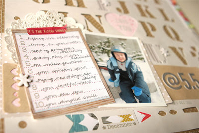
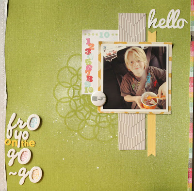
Here are a few layouts I created from the weekend. I actually have several more plus a few cards, but have been too busy to photograph and upload. Imagine that!
Here they are:
This one is from Studio Calico City of Lights | Sorbonne Add-on. I exact knifed out the "o" and carved it into a heart, misted piglet on white card stock and stamped with the stamp set from this add-on. Little bits of layering and embellishments along with machine stitching and washing. Color balance is a bit off from IRL color as it's been a sunny/cloudy kinda day.

This layout was made with the Louvre Add-On from @Studio_Calico as its base.
Love that mask from Christy Tomlinson.
I don't have a good pic of it yet but the "O"s in the Fro and Go go are wound up baker's twine -to mimic candy toppings and yo-yos. (IDK, with the fro-yo I just naturally thought of yo-yos too).

Had a bit of fun playing with the striped paper to create a twist on the chevron trend. A bit of an optical illusion and that's right up my alley. ;)
Check back later for a few more layouts. Happy Sunday everyone! :)
Oh, and if you happened to download the Silhouette Designs from my last post and have been crafty with them, please leave a comment and a link to what you created. :) Would love to see! :)


Hi, Suz! You're layouts are fab, as always! And, I just downloaded your awesome file- Thank you!!!! I just received my Cameo a few weeks ago and haven't taken it out of the box, yet (shame), but when I do I will be sure to create something with your awesome tags and link back up to your blog! Have a great week!
ReplyDeleteOMG girl those layouts are amazing, and i have to say your layout with the stencil is got to be my favourite that i have seen so far it is FABULOUS
ReplyDeleteFabulous layouts!!! I've been wanting to use that SC paper with the alphas since I got my kit, but haven't been able to play with it yet!!!
ReplyDelete